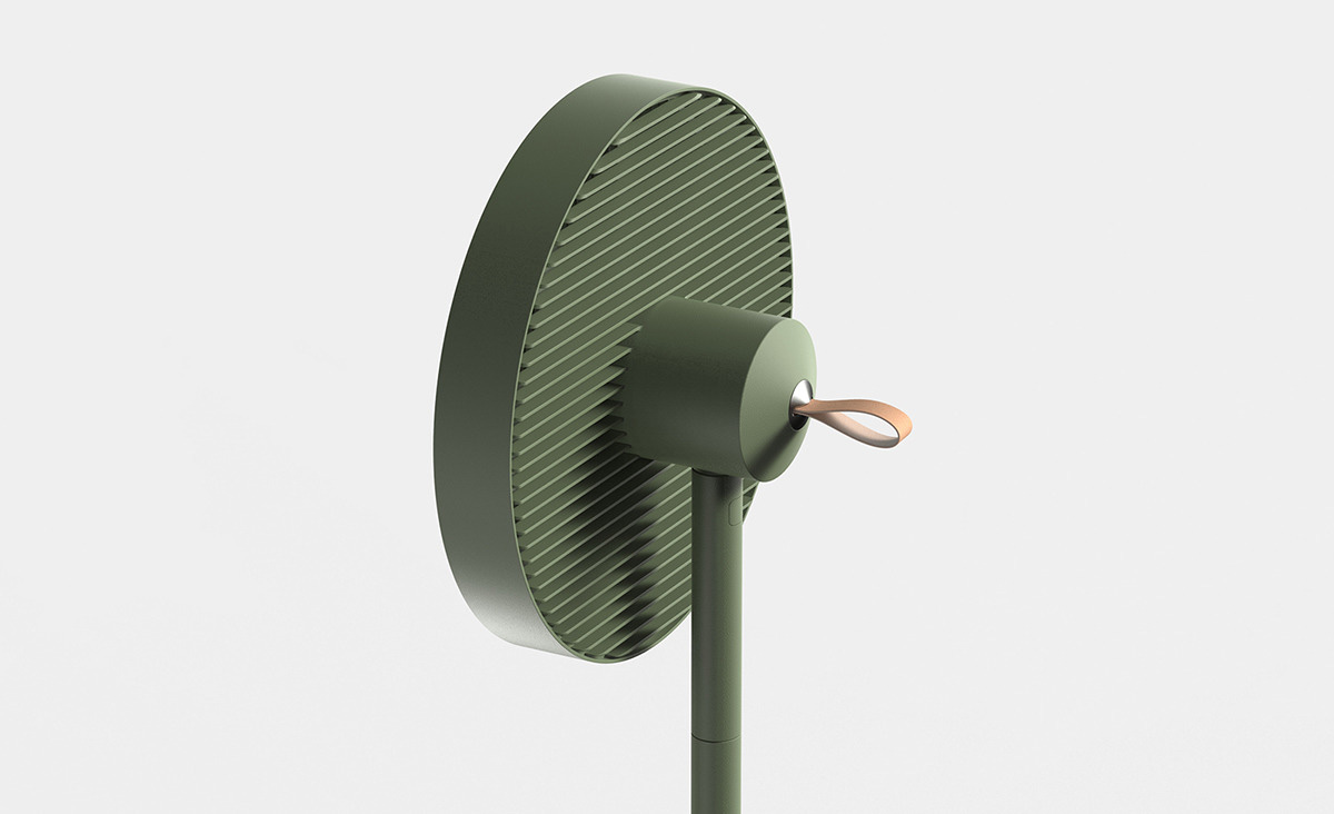
In page layout, illustration and sculpture, white space is often referred to as negative space.
It is the portion of a page left unmarked: margins, gutters, and space between columns, lines of type, graphics, figures, or objects drawn or depicted. The term arises from graphic design practice, where printing processes generally use white paper. White space should not be considered merely “blank” space — it is an important element of design which enables the objects in it to exist at all; the balance between positive (or non-white) and the use of negative spaces is key to aesthetic composition. Inexpert use of white space, however, can make a page appear incomplete.
When space is at a premium, such as in some types of magazine, newspaper, and yellow pages advertising, white space is limited in order to get as much vital information on to the page as possible. A page crammed full of text or graphics with very little white space runs the risk of appearing busy or cluttered, and is typically difficult to read. Some designs compensate for this problem through the careful use of leading and typeface. Conversely, judicious use of white space can give a page a classic, elegant, or rich appearance. For example, upscale brands often use ad layouts with little text and a lot of white space. For publication designers, white space is very important. Publications can be printed on a variety of different papers, which can have different colours, textures, etc. In these cases, white space is used for good presentation and for showcasing the different stocks.


